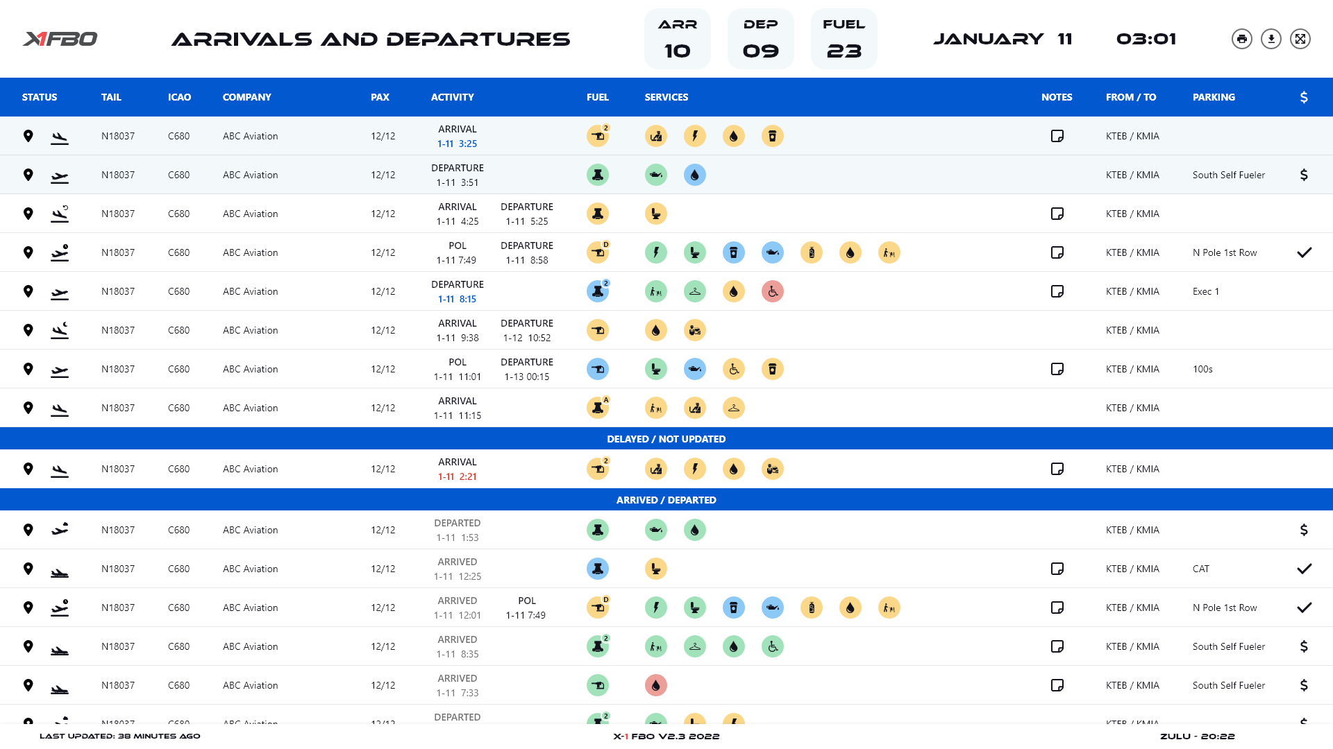
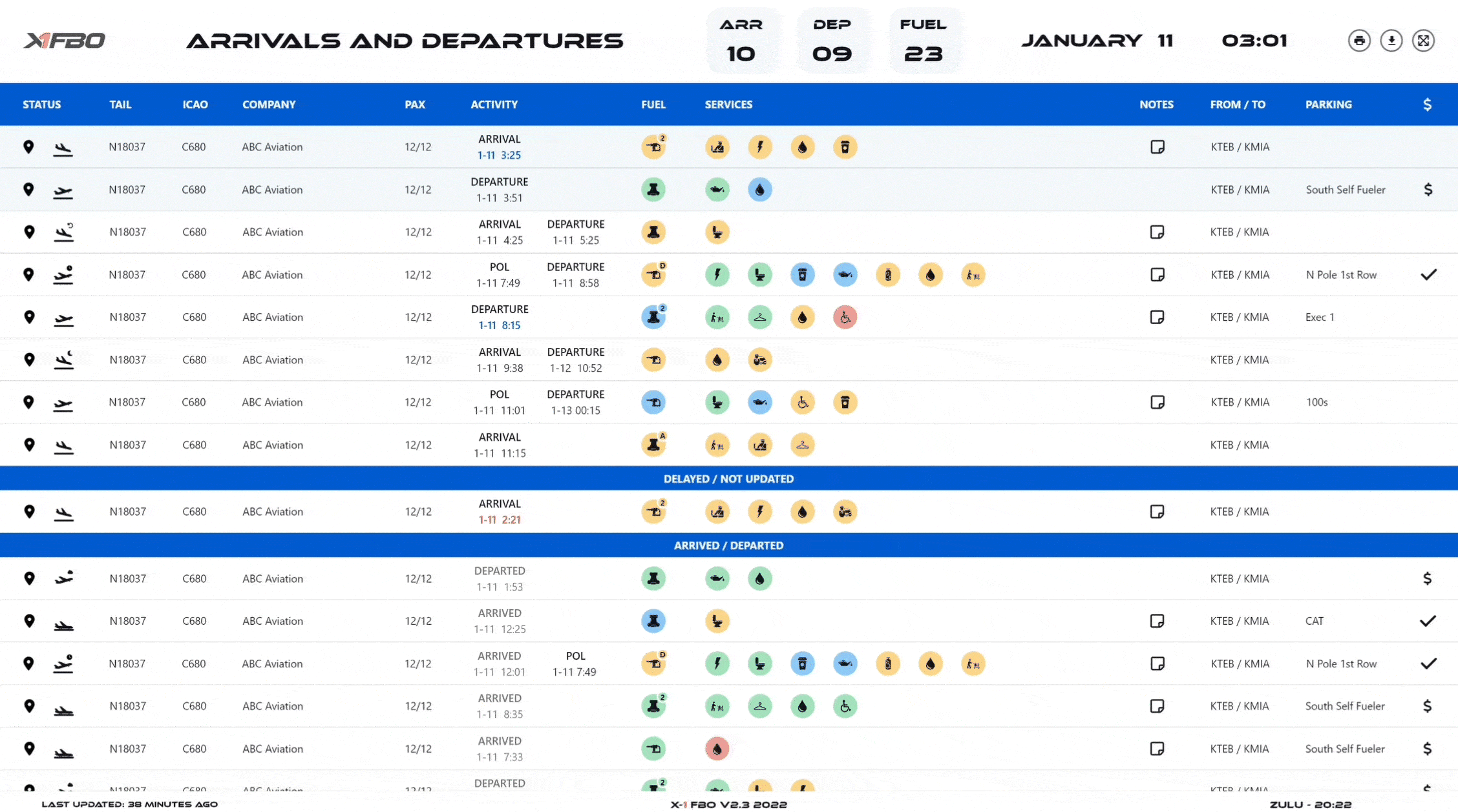
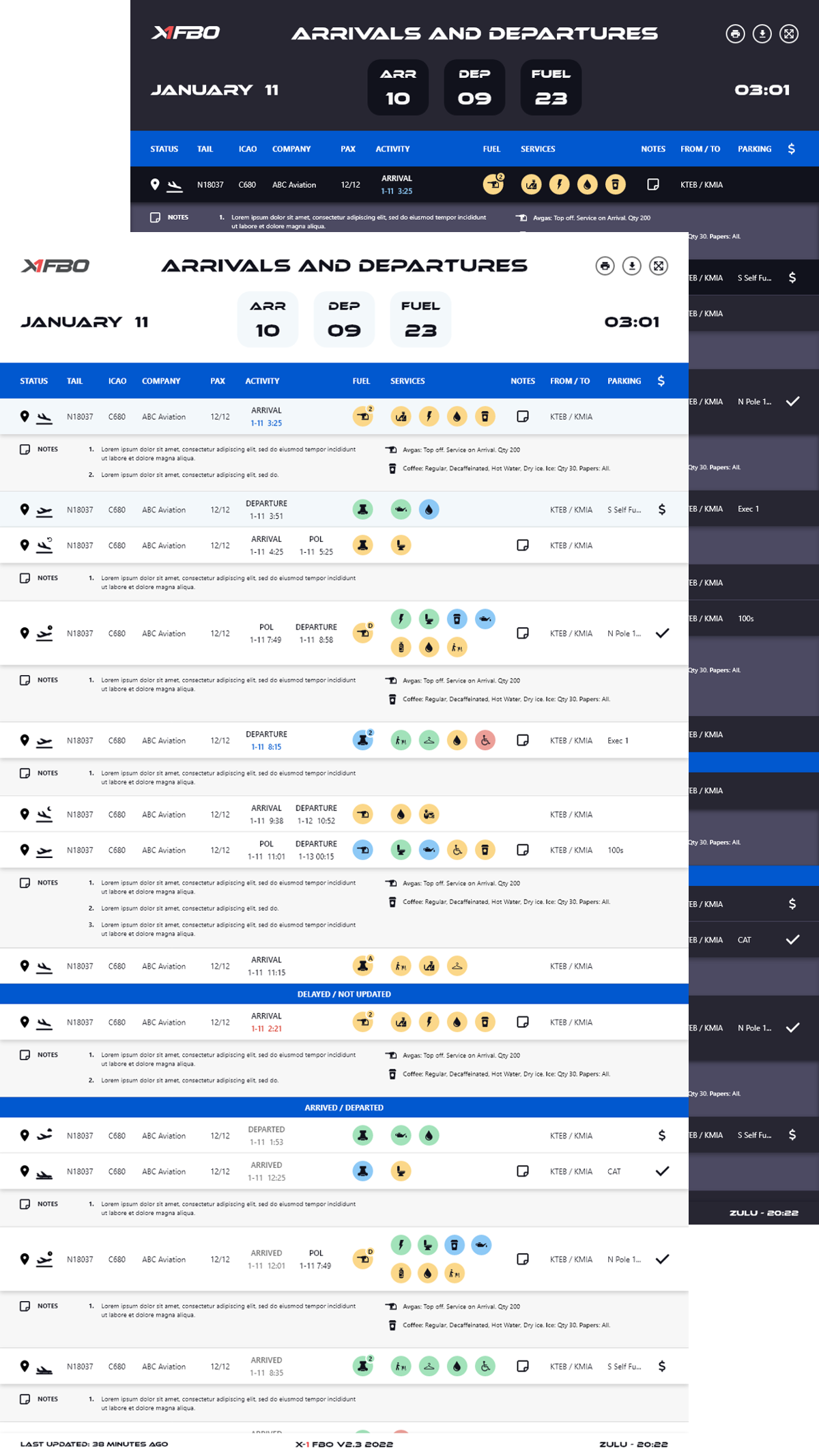
Arrival and Departure Board
I established the first design and research process to create user-centered designs backed by data for private airport logistics software.
Background
X-1 FBO is redesigning its B2B software for private airports.
The main challenge is to serve everyday tasks for diverse operating airports and their users with various roles. The other challenge was that X-1 FBO had no history of a design process or research.
The goal is to improve the usability of X-1 FBO for both new users and existing users by consolidating redundant features, updating the UI, and creating new features.
- Process: User Research, Wireframing, Prototyping, Usability Testing
- Tools: Double-Diamond, Material Design, Adobe XD
- Duration: September 2020 - March 2021 (6 months)
- Role: UX Intern
- Team: Business Analyst, Software Engineer, UX Designer, UI Intern
Key Accomplishments
- Developed a new design process and research plan. Established structured guidelines for an adapted version of the Double Diamond design process to uncover user's experiences and pain points.
- Implemented user-centered designs. Developed and conducted surveys, user interviews, A/B testing, and usability testing on over 60 participants to discover what users want and need.
- Designs backed by data. Analyzed user research and usability testing data to discover solutions and design wireframes, prototypes, and simple workflows for other associated products.
- Established a Design System. Checked user accessibility and created Material Design guided icons, component, and design guidelines to maintain consistency in look and feel of design across all products.
Design Process
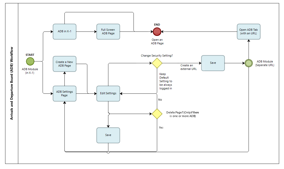
Since there was no previous user research or a set process, I based the new design process on the Double Diamond, which includes the discover, define, develop, and deliver phases. Due to X-1 FBO’s 10 different modules, this altered version contains a mini discover and define phase to prioritize the modules.
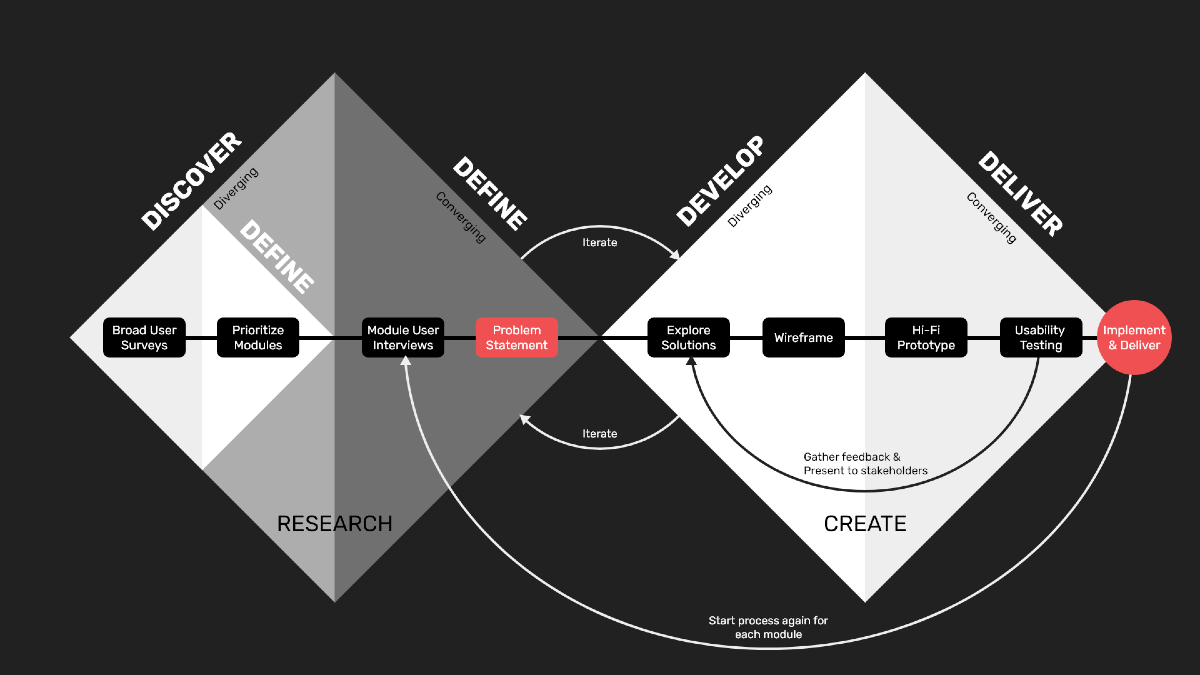
During the mini discover and define phase, both the current and new users were surveyed. They were asked to rate the frequency and the usability of each module, as well as open-ended questions about their attitude toward the modules. The modules were prioritized based on high frequency and low usability ratings.
User Research
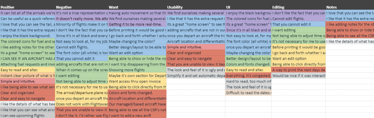
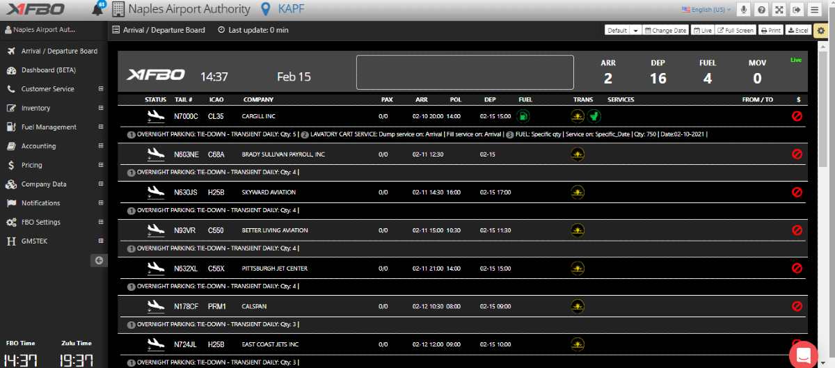
The first module in the design process was the Arrivals and Departure Board. It serves as a snapshot of the airports’ daily activities, such as viewing the flight types, time of arrival and departure, services requested, and notes. I conducted user interviews to gather more detailed feedback based on the initial survey responses and for follow-up questions. Data were analyzed by grouping common themes and features from the user’s observations through this affinity map. Each color of the map represents a user.
User Problems
- 60% of the users reported cluttered User Interface.Colors, fonts, and layouts were hard to read and gather information in one page.
- 80% of the users reported rigid information display options.Any of the information shown, such as date range, flight type, and notes, were not able to be changed.
- 40% of the users reported limited access.All users were logged out every 24 hours from the software and had to keep logging back in.
Solution Ideation
- Improved User Interface
- Accessible design with larger fonts, clear separation of rows of information, and color contrasting icons.
- Option for portrait mode to fit in more information in one page.
- Light vs dark mode.
- Customization through Settings
- Create multiple Arrival and Departure Boards and see previews with custom settings based on each FBO’s needs with the new Settings Page.
- Create separate URL links to prevent forced log-out from software.
Wireframing & Prototyping
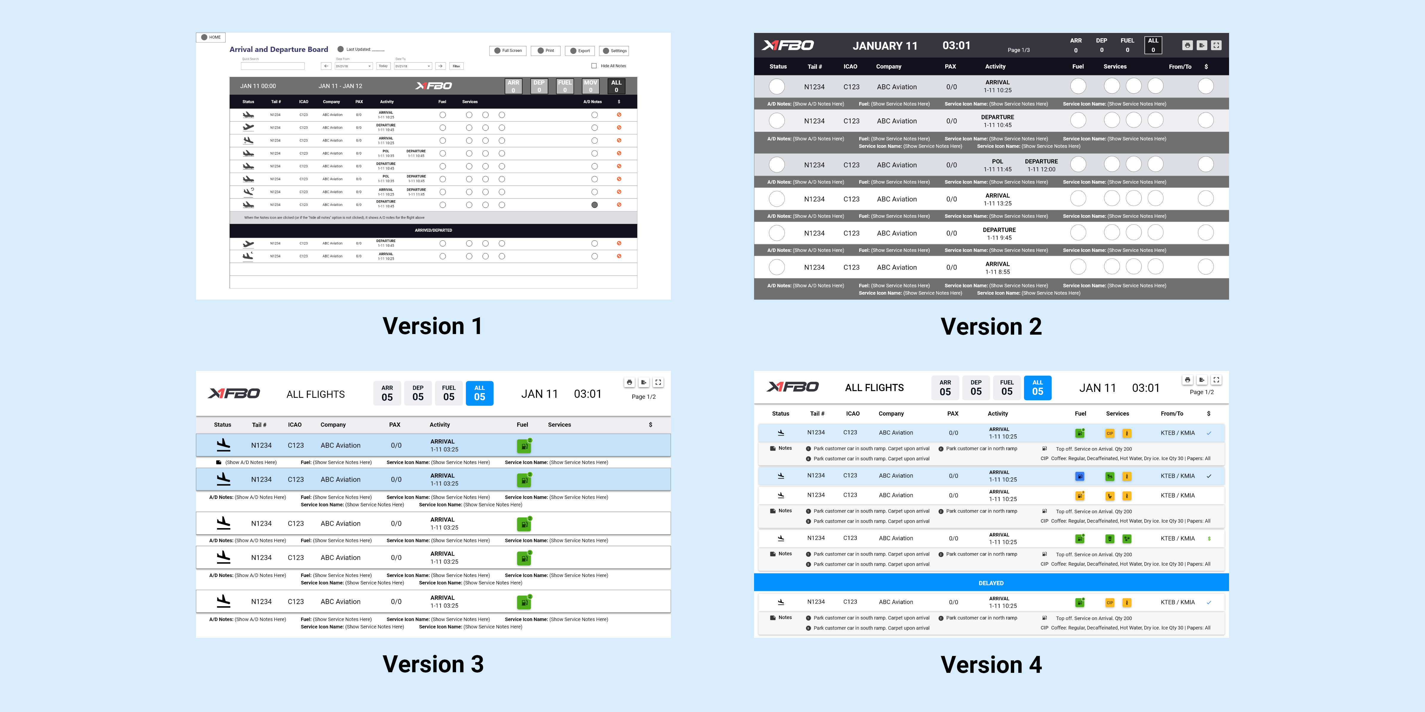
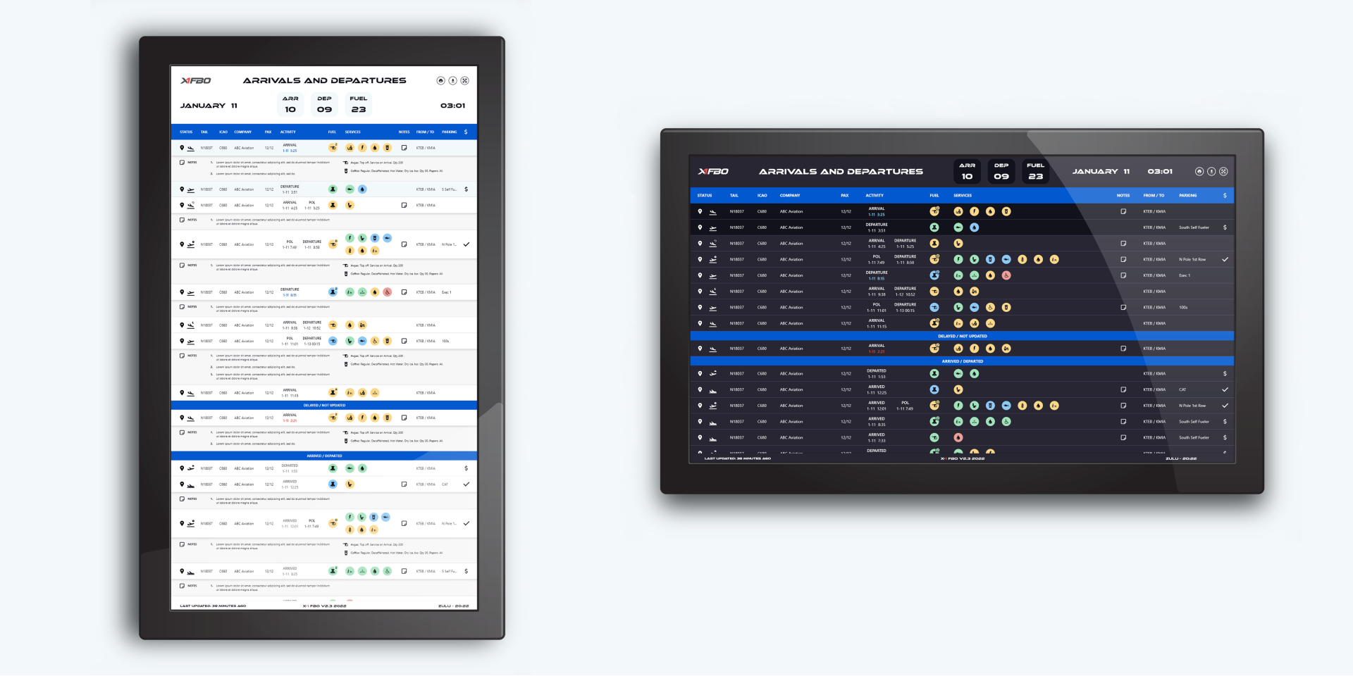
Initially, the user problem of rigid information displayed on the Arrival and Departure Board was to provide interactivity with the page. However, due to the volume of options users wanted, there were limitations with the engineering. Version 1 shows the notes section being able to be hidden with a click but that feature disappeared for Version 2 and was moved to the new settings page.
The other main change throughout the iterations is the user interface. Users wanted bigger rows, fonts, and icons and better color contrasts to easily read the board. The fonts and icons were overcompensated from the previous small fonts and at the end was pulled back to be the perfect size to follow Material Design guidelines. Each row was transformed into card components to further distinguish from each other and the icon colors were brightened to follow the WCAG accessibility guidelines.
Version 4 of the iteration was turned into an interactive prototype for usability testing.
Validating Design Decisions
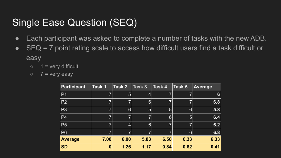
I conducted usability testing by asking users about their initial impressions and asking them to complete scenario-based tasks on the new design. During each task, users were asked to give a rating on how easy or difficult the task was with the Single Ease Question. The observations were analyzed through the rainbow sheet to show the frequency and Jakob Nielsen’s usability severity rating. This scale ranges from 0, not a usability issue, to 4, a usability catastrophe.
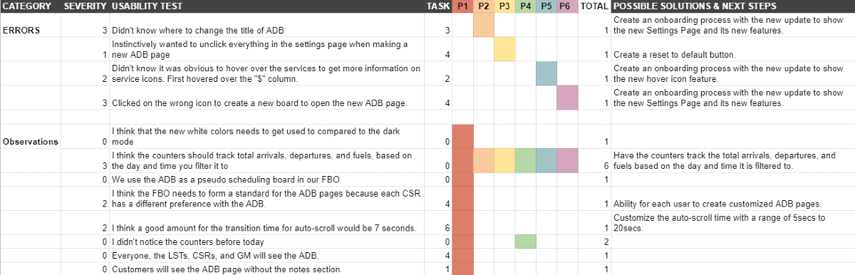
Results
- 83% of the users found the new colors, fonts, and layouts improved readability.
- 100% of the users liked the new customization of multiple arrival and departure boards.
- 67% of the users liked the control of security settings.
After discussing the results with the team and stakeholders, there were only minor changes such as creating an onboarding experience and changing the names of categories. Overall, the users found all the tasks easy to complete and there were no catastrophic usability errors.
Animations
Since the Arrival and Departure Board was transitioning from a static page to a customizable page, I wanted to also animate the board updating in real-time, inspired by the analog arrival and departure boards.
Final Mockups
Old vs New:
Updated User Interface
- Larger fonts and icons
- Distinct column space
- Distinction for flight categories
- Colors pass the WCAG accessibility guidelines
- Material Design guided components and icons
- Light vs Dark Mode
- Landscape vs Portrait Mode

New Features:
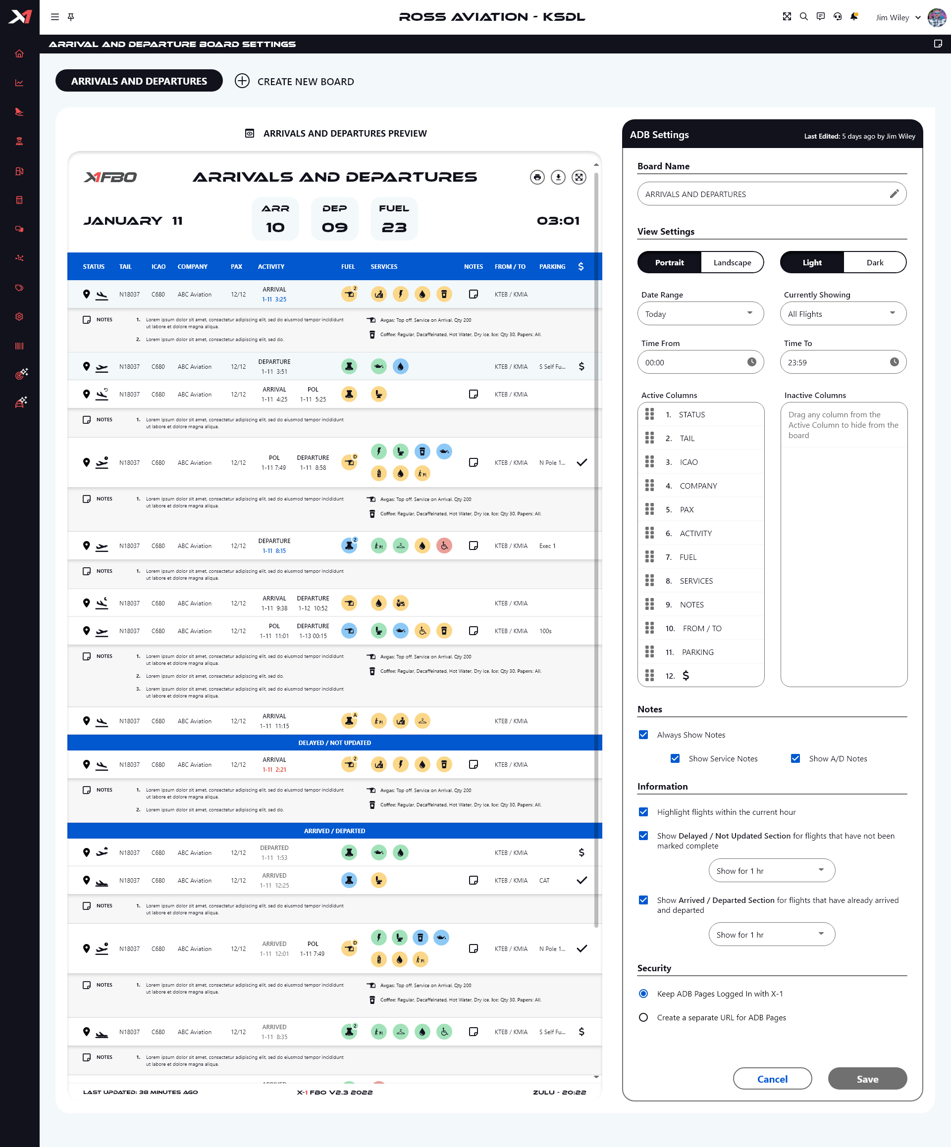
The Settings Page
- Create multiple pages
- Display selected information
- Re-arrange column orders
- Customize date range, time, and types of flights
- Show or hide notes
- See preview of the page
- Create separate URL to prevent forced log-out from X-1 FBO
Customizations
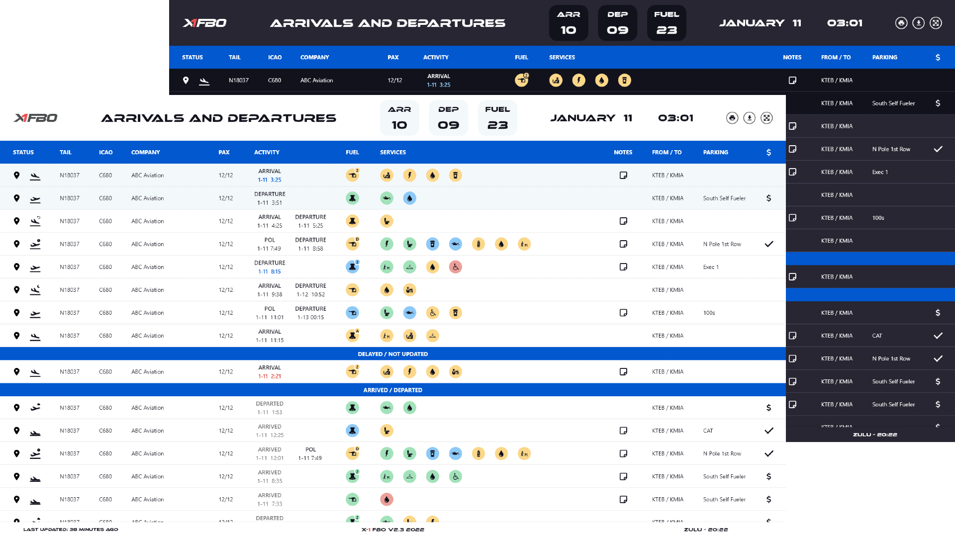
Choose how to use the Arrival and Departure Board for your airport.
The Landscape mode will suit users who don't want to see all the notes for a quick snapshot of the flights. Portrait mode allows more information to be shown at a time and space to show full notes of the flights.
Takeaways
The final design was created after the feedback from the usability test and handed off to the development team. This iteration is still currently ongoing after my internship. Some takeaways from this project and internship are:
- Presenting User Data. The team needs to understand the user data and the analyses easily to back up design decisions. Visual data and creating powerpoints are key to present these data.
- Company Goals. There needs to be a balance of advocating users’ needs and wants and still meeting the company goal of creating profitable products.
- Flexibility. The entire design process can take longer than the original timeline and a lot can change in the process with the constant feedback by the team, stakeholders, and users.