Ink Tank
An app for tattoo lovers.
Background
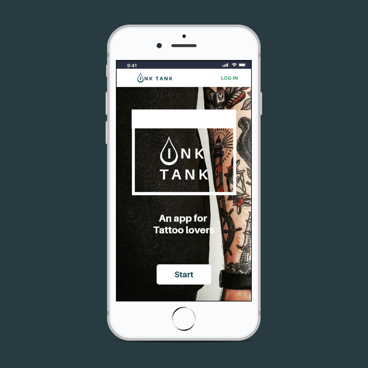
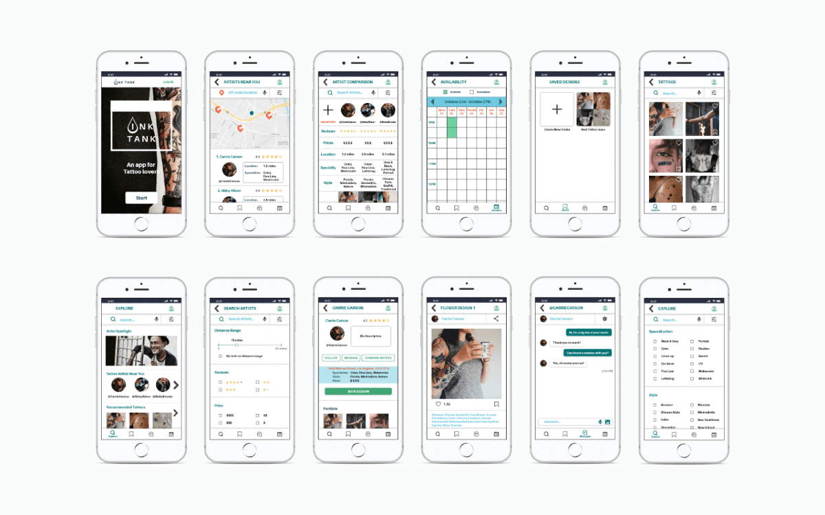
Ink Tank was a project created for the CareerFoundry UX Design Certification. It is an app for tattoo lovers to find tattoo design inspirations and nearby artists.
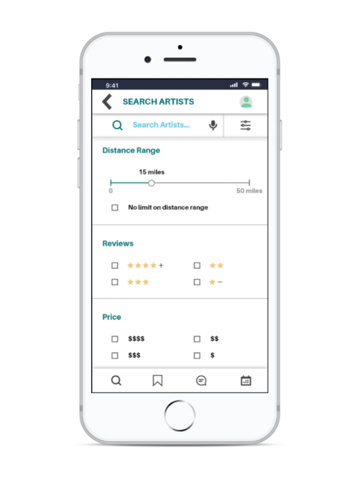
Ink Tank was created to help users streamline the process from filtering through categories such as specialties, prices, and reviews. to comparing artists and booking sessions. This project is a native app to help users who are busy and on the go.
- Process: User Research, Wireframing, Prototyping, User Testing
- Tools: Design Thinking, Material Design, Figma, Adobe XD
- Duration: August 2019 - February 2020 (6 months)
- Team: Independent Project
Competition & User Research
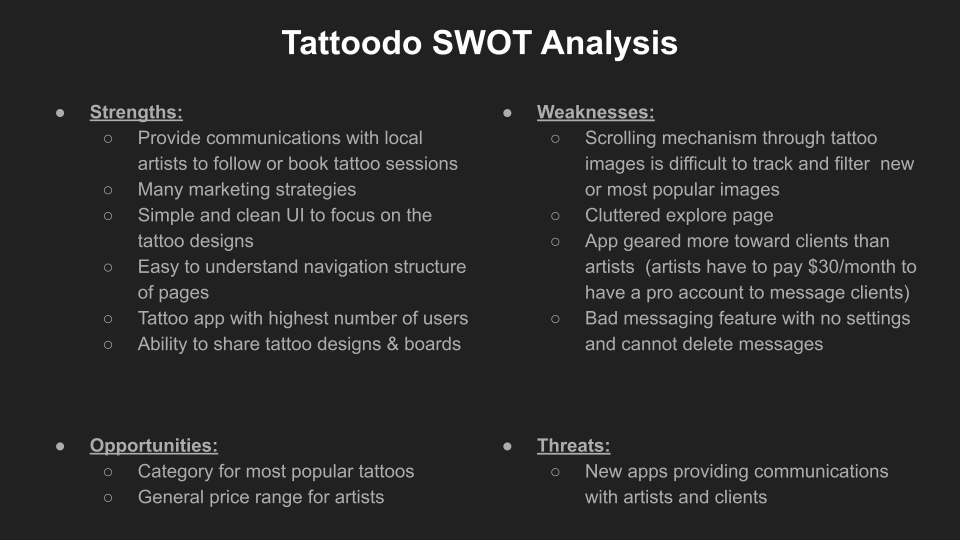
I conducted an initial competitive analysis, 71 surveys, and four interviews. Two apps, Tattoodo and InkSquad, were chosen for SWOT and UX analysis. I focused my competition analysis on Tattoodo since it is the biggest community in the market. Through this competitive UX analysis, Ink Tank has an opportunity to make the app free, improve on the messaging, explore, and search features.
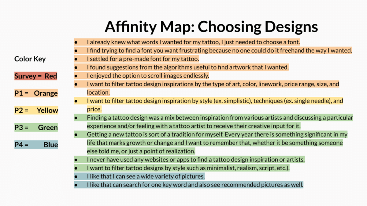
For my user research, one challenge I faced was my unfamiliarity with the tattoo culture. So I reached out to my personal connections and communities, such as Reddit's r/tattoos, filled out the initial survey. I analyzed both the survey responses and user interviews through affinity maps.
User Personas
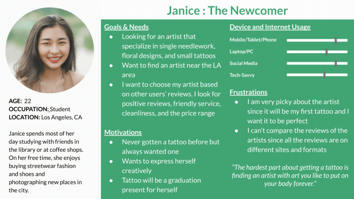
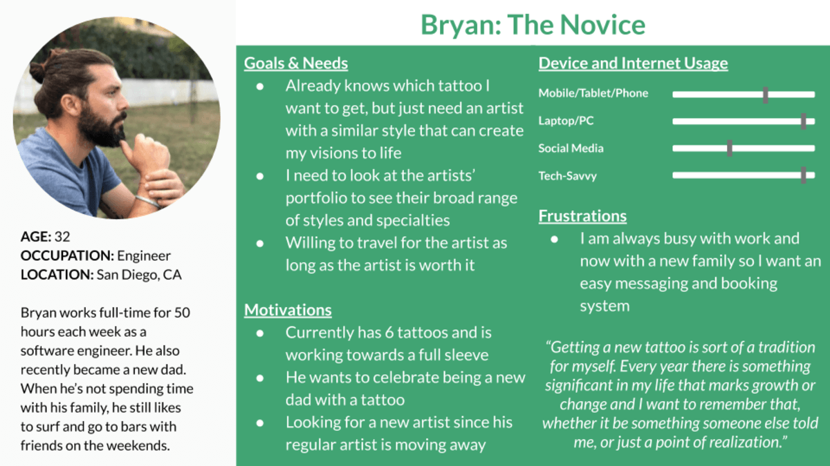
I gathered insights from user research to make two personas. Creating Janice and Bryan Personas helped me prioritize functionality based on the real data from Ink Tank's target users. These Personas focused me on Ink Tank's core features of a detailed filtering system for artists and an easy scheduling system.
User Problems
- Finding Designs & Artists
- Difficulty finding specific types of tattoo designs
- Difficulty finding artists with a personalized taste of the user
- Contacting Tattoo Artists
- Want to quickly communicate with artists for a tattoo session
- Want to book, reschedule, and cancel tattoo sessions easily
Solution Ideation
- Filter for the Perfect Match
- Over 50 tattoo design categories to filter and search
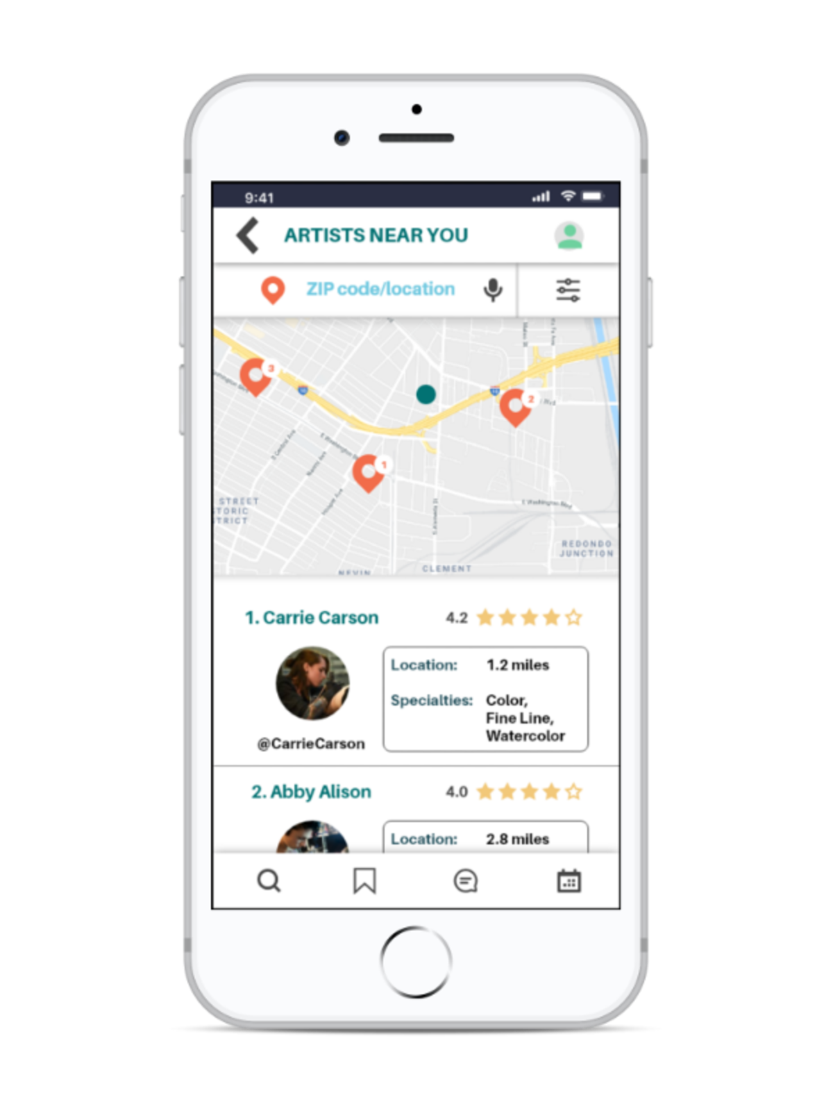
- Find artists nearby and compare based on price range, reviews, specialty, and more
- Artists in the Community
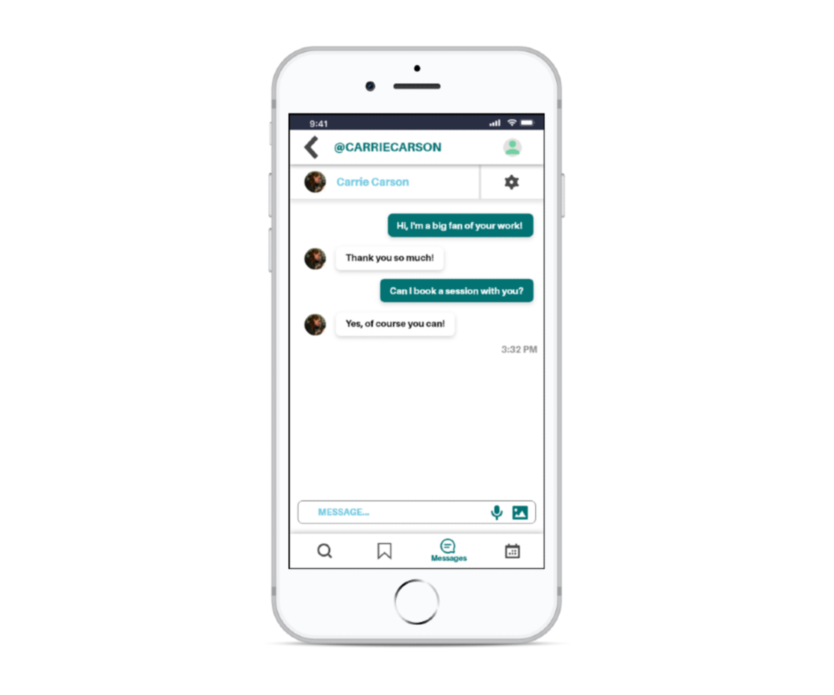
- Directly message tattoo artists with any questions or requests through Ink Tank
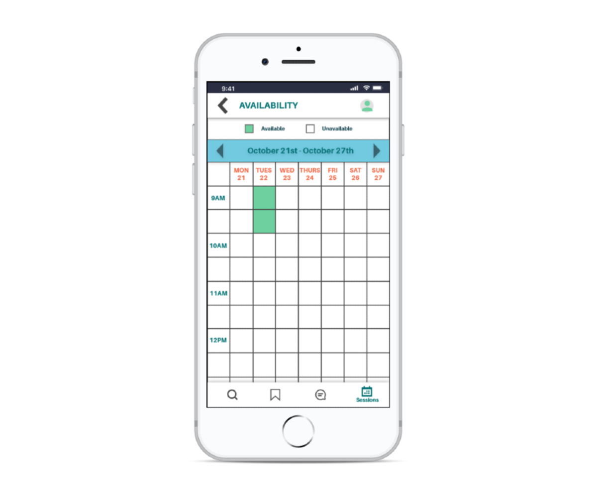
- Book sessions based on the artists' availability
- Reschedule and cancel sessions on Ink Tank
User Flows & Sitemap
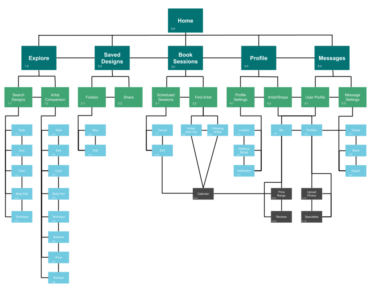
User flows and the sitemap were created for Janice and Bryan’s objectives. The sitemap of Ink Tank was revised after the card sorting analysis. Five participants participated in an open card sort via Optimal and each session took about three and a half minutes each.
Card sorting for the sitemap helped include more connections to each feature, such as 80% grouping on canceling session, rescheduling session, and calendar and 60% grouping on block user, report user, reviews, bio, and portfolio.
Wireframing & Prototyping
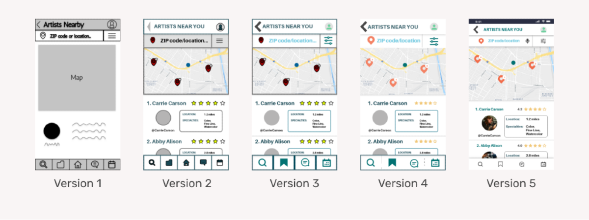
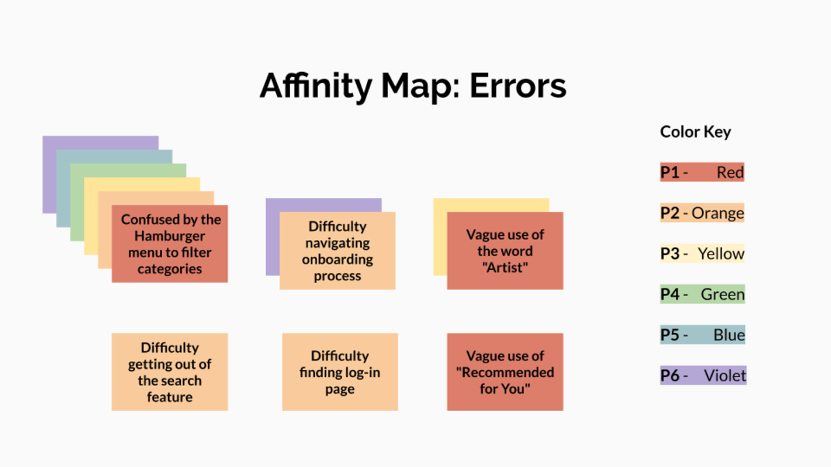
Version 1 shows a low-fidelity wireframe that was transformed into the interactive prototype in Version 2. This version was used to conduct the usability testing. Other than the main error of a confusing icon for filtering for search results, I received feedback about the dark colors of the user interface. I fixed the error and lightened the colors to give Ink Tank a friendlier environment.
During Version 3, I learned basic design principles such as the law of proximity, unity, and hierarchy. The now updated Version 4 was then reviewed by fellow students and was introduced to Material Design guidelines. The feedback and guidelines allowed me to create consistent and cohesive design elements for Ink Tank. I used my new design knowledge to create a minimalistic design to highlight the various tattoo designs
Usability Testing
The usability test results showed that Ink Tank still needed improvements in its user experience design. The main problem it faced was the confusion of the hamburger icon to filter through search categories. All six participants encountered challenges figuring out this feature. Changing the hamburger icon into a universally recognized filter icon helped users understand the filter features of the app.
Final Mock-ups
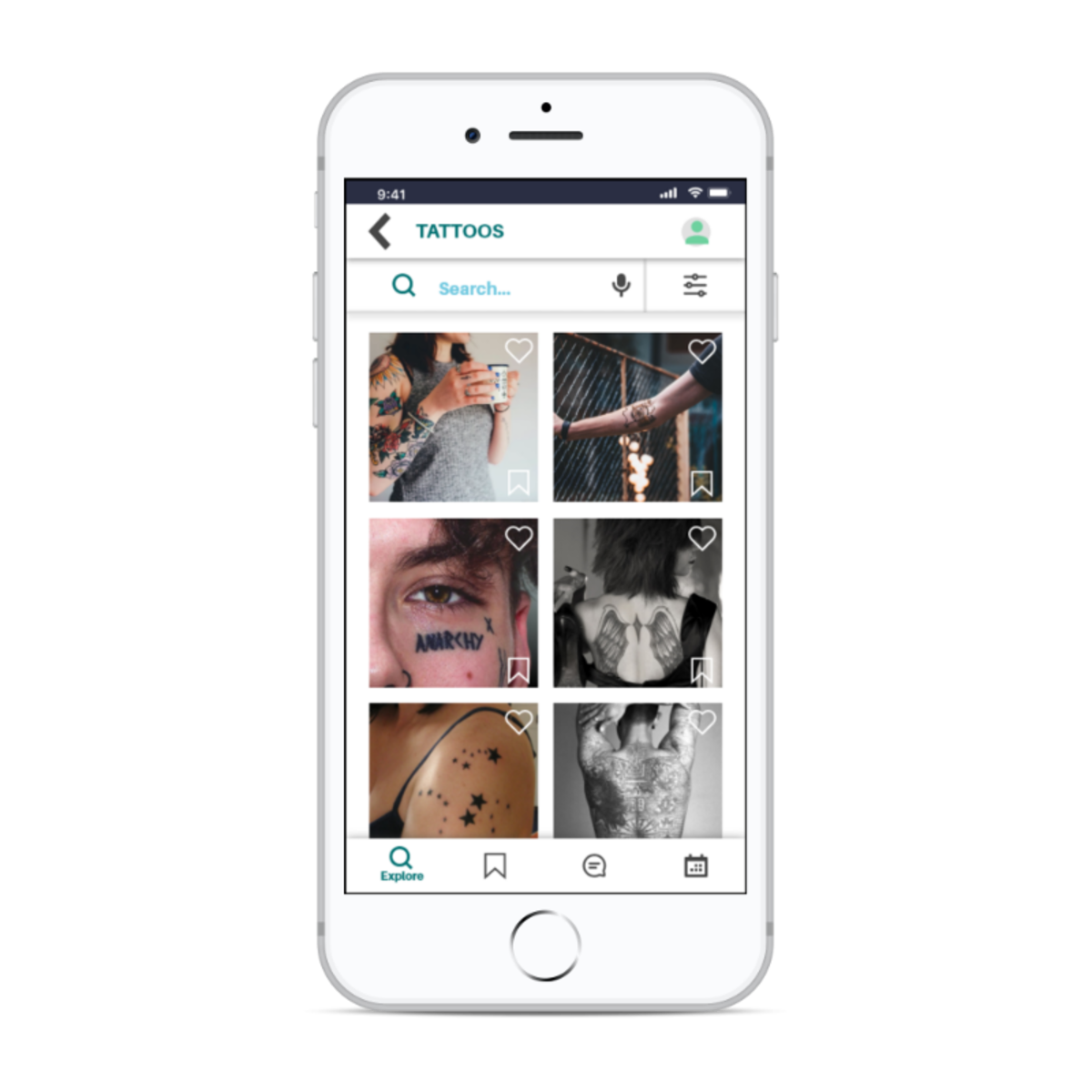
Search & Filter
Over 50 categories to filter tattoo design inspirations
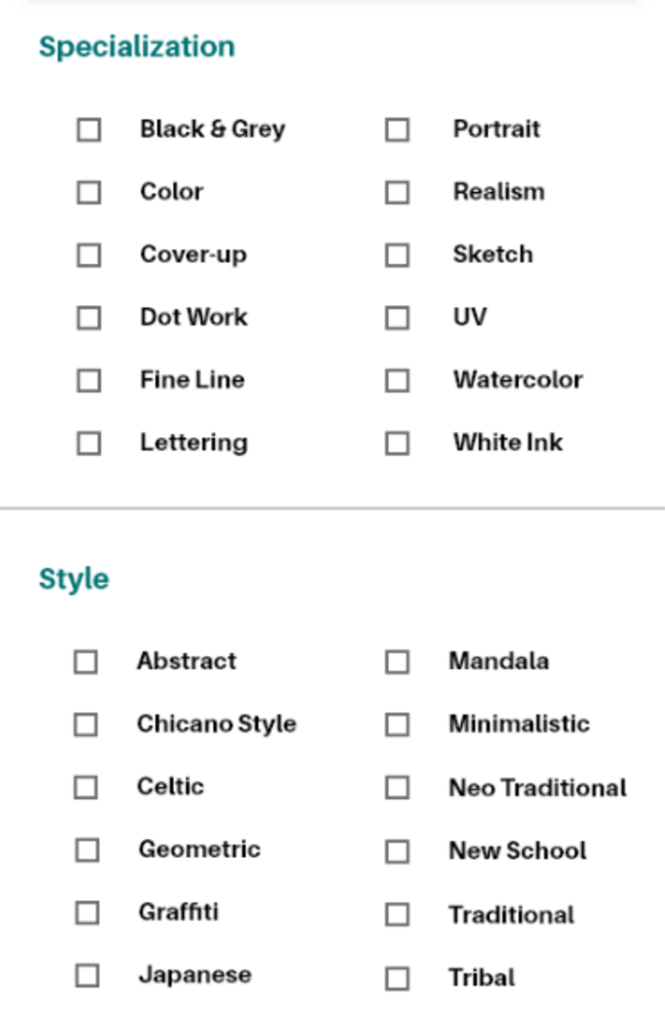
Finding Artists
Communication
Design Language & Documentation
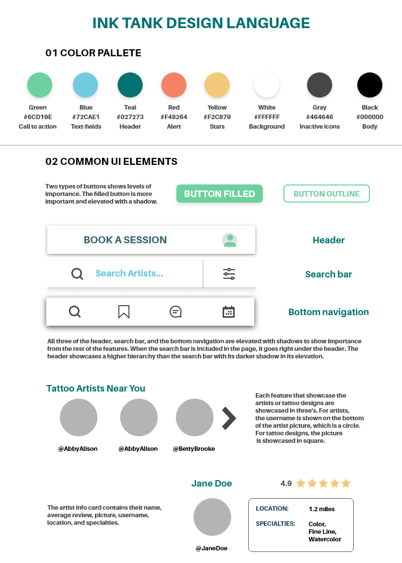
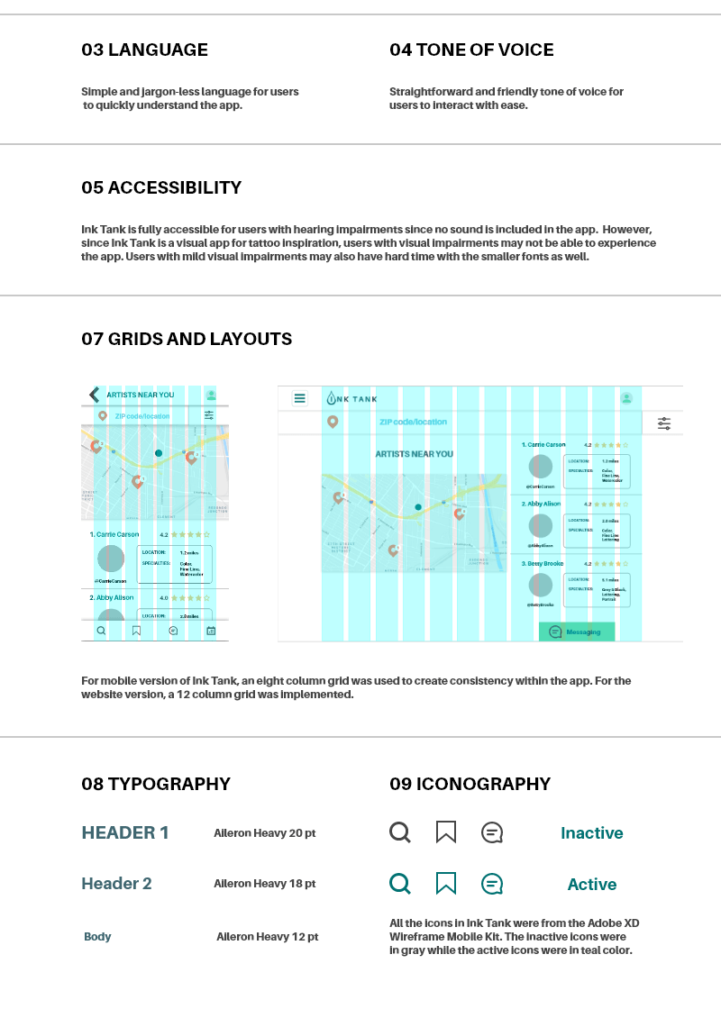
In order to maintain a consitent design for future iterations of Ink Tank, I also created a design language documenation. This language sets the standard of the overarching rules for the product. These rules apply to the color pallette, UI elements, language, tone of voice, accessibility, grids and layouts, typography, and iconography.
Takeaways
I practiced the foundations of user experience and product design through creating on Ink Tank.
I learned Design Thinking methodologies and basic design principles. I was also introduced to Material Design guidelines for consistent designs.
The iterative process allows products and experiences to continuously improve for users.
