Front-End Portfolio Development
Front-end development for an online portfolio.
Challenges
This portfolio website was a project for the CareerFoundry front-end development course for UX designers. As a UX Designer, I needed a visual medium to present my designs to build a professional network.
Through creating my own online portfolio, I wanted to highlight my UX and research skills as well as showcase my foundational knowledge on front-end development. The goal for this portfolio is to gain weekly traffic to my website and have people contact me through visiting my site.
- Process: Mobile-First Design, Responsive Design, Front-end Development, Usability Research
- Tools: HTML, CSS, JavaScript
- Duration: February 2020 - April 2020 (2 months)
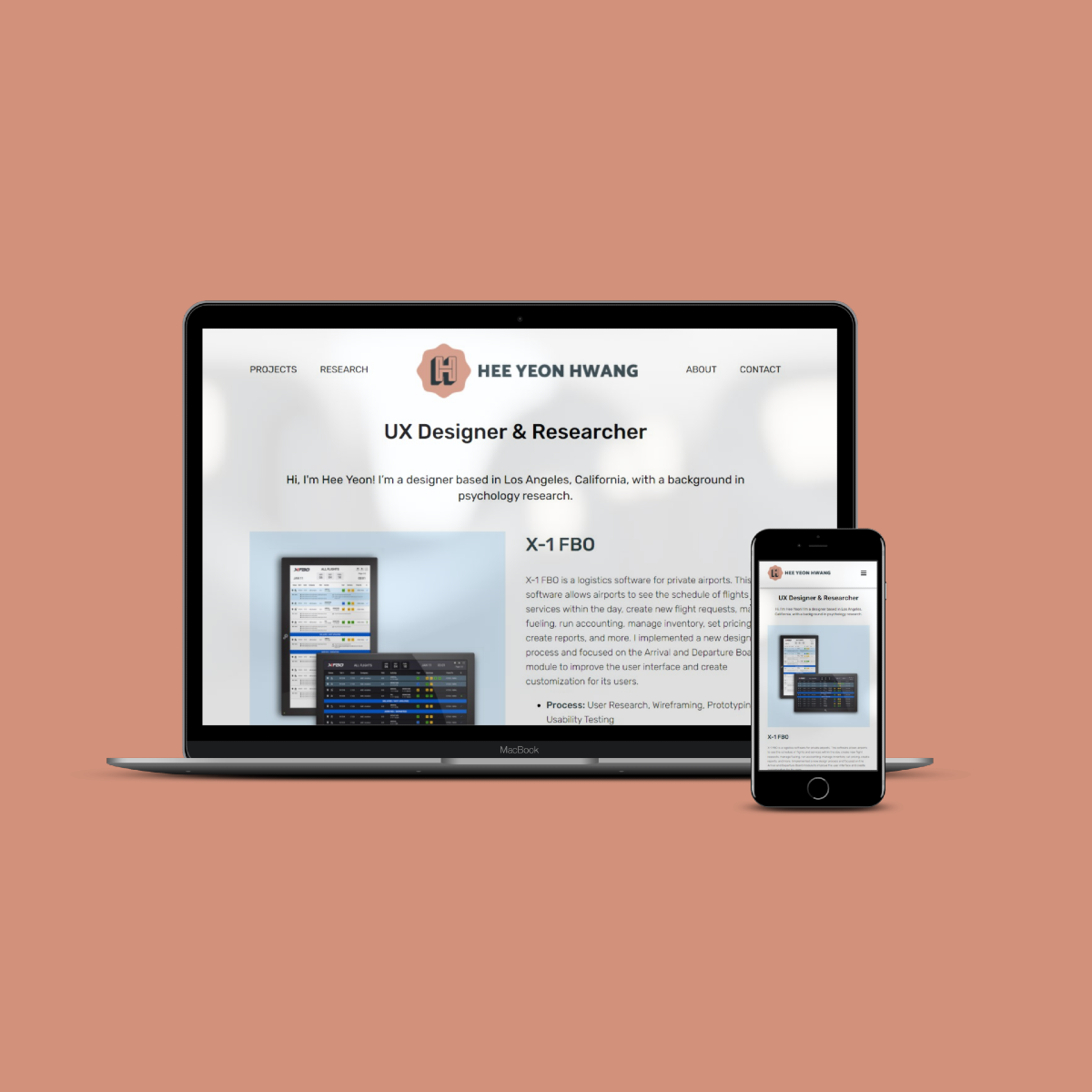
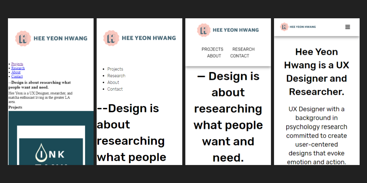
Responsive Design
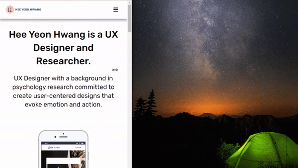
To showcase my portfolio on a website, I wanted a responsive design to have my website easily accessible in all screen sizes. So I started with a mobile-first approach, creating my layout with the smallest screen size and then adapting to larger screen sizes. To create this responsive design, I used HTML, CSS, and JavaScript.
With the smaller screens the users would have to scroll through more content on each page, so I wanted to provide a simple and noninvasive consistent navigation bar. The navigation bar for mobile devices was fixed at the top of the screen but consisted of a hamburger menu to keep the bar from taking up too much screen space.
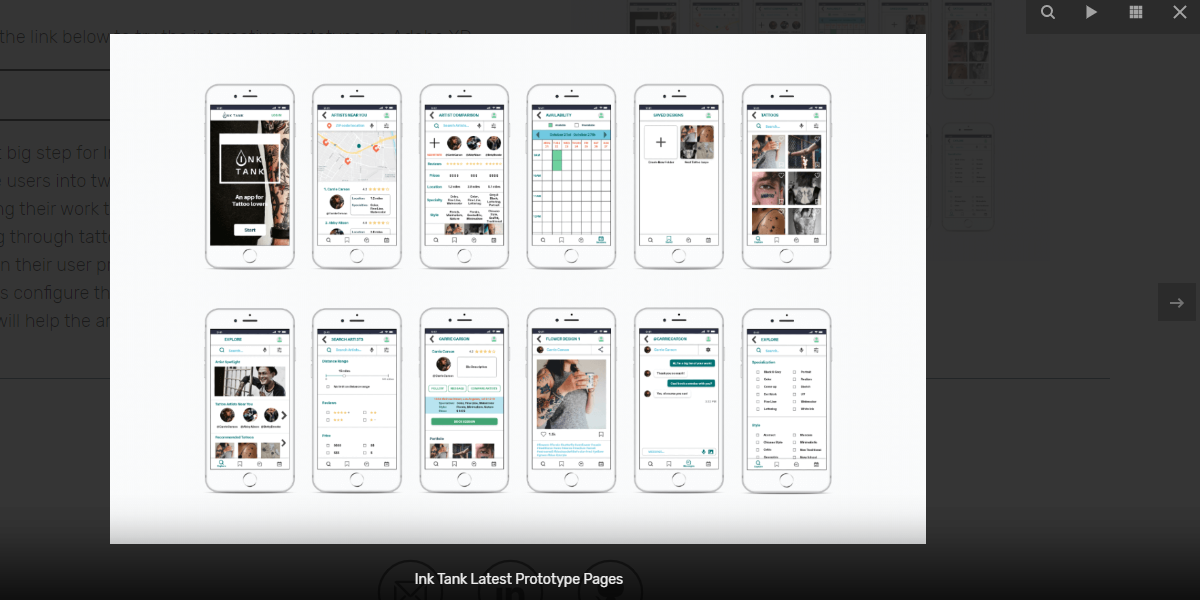
Lightbox
In order to showcase my design, I wanted users to be able to look at the images closer and have the ability to zoom in. I added a lightbox JavaScript library to create a pop-up window overlay of the image, once you click on them. Users can see full-screen images with this overlay as well as scroll through the collection of images on the page.
Click on the images on this page to try out the lightbox.
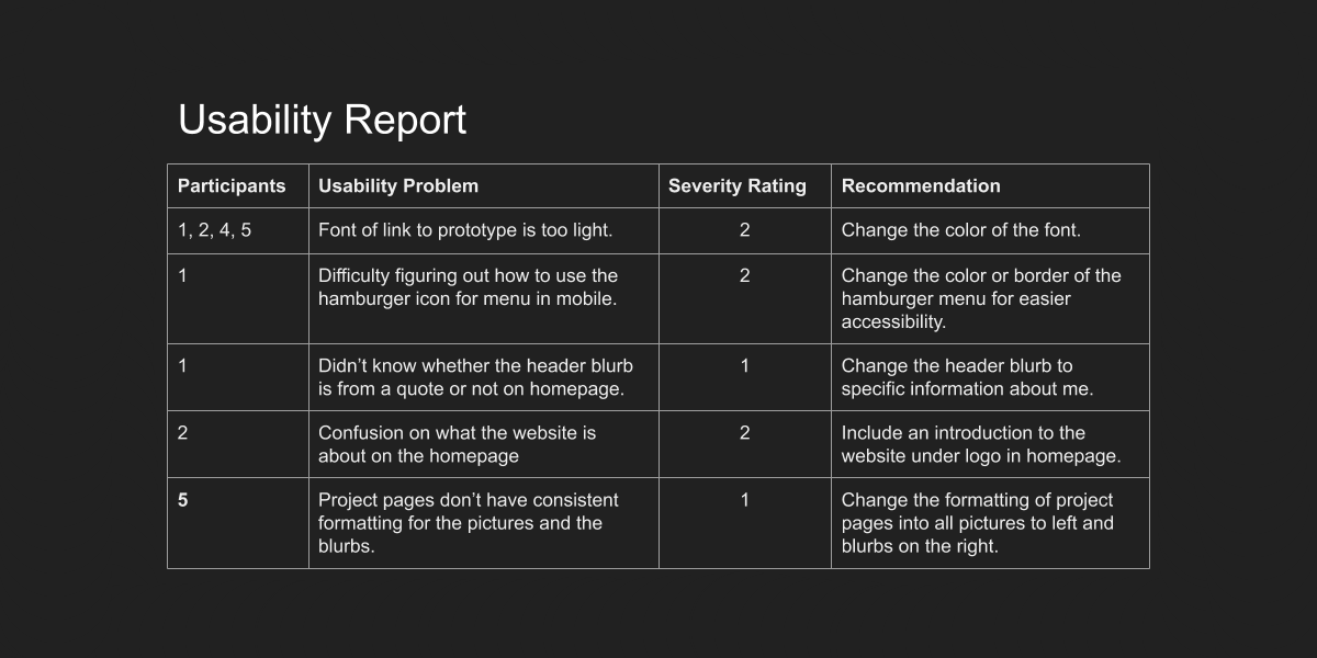
Usability Testing
Usability testing was conducted with five participants to test the portfolio website. The participants were asked to complete six tasks on their computer. The errors they encountered were measured by Jakob Nielson’s error severity rating scale. The main problem all the participants observed was that the font color for the link to the prototypes were too difficult to read. Since then, I changed the text link into a button for better visibility.
Accessibility & Code Quality
Since the color of the font was an issue during the usability testing, I used the W3C Color Accessibility Check to pass the site with AA compliance. I also added captions on images for the projects pages.
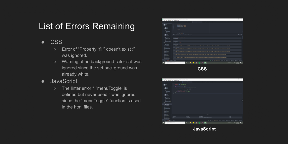
In order to ensure my code quality for the portfolio website, I used three different linters with Atom. The linters I used were W3C-Validation, Linter-stylelint, and Linter-JS-Standard. I fixed all the errors from the linters except for two errors that did not need to be fixed and warnings about the background colors. Lastly, I also performed cross-browser testing on Chrome, Firefox, Safari, Microsoft Edge, Android, and iPhone.
Porftolio Website & Next Steps
Please see the gif to see the responsive design in action as one of the examples.
The portfolio website presents responsive design through a fixed navigation bar on mobile screens and prioritizes my design skills through lightbox overlays for images. I will regularly update my portfolio with my projects and the next steps would be to provide a night mode on the website.